The PlotCaptions Dataset: Automating the Narration of Visual Analytics

I’ve always been interested in how we narrate visual analytics. The hardest task in dataviz is not analysis or visualization, but figuring out what to say about it. I used to believe that a well designed chart does not need a narration. That may be valid, but over the years I’ve realized that it is the narrative that turns something that is merely pretty and insightful into something that is viral. Imagine one of Hans Rosling’s talks without him in the picture.
Natural language as a modality for communicating analytical insight remains underrated, even in the post-LLM world. Analysis and visualizations can be interpreted in many different ways, but it’s only language that can be made arbitrarily less ambiguous. Generative AI may have solved the problem of creating charts, but there’s a larger unsolved problem: of all the things we could say about a chart, which is the biggest, most useful and surprising?
I think the answer lies in breaking away from the mechanics of creating charts, and looking at visual analytics as a single continuum, in which the data, the analysis, the visuals and the narrative are all respective steps in a process that decrease complexity, compress information and increase comprehension. Unfortunately, because of the rise of self-service BI tools coupled with inexpensive language generation, we often end up with dashboards which upset this continuum. The mathematician Gregory Chaitin wrote,
… comprehension is compression. You compress things into computer programs. The simpler the theory, the better you understand something.
While Chaitin was talking about the communication of scientific facts and axioms, it is not hard to see parallels to this in visual analytics. E.g., anyone who practices data analytics eventually concludes that a dashboard, to be effective, must compress data. A chart must be simpler than the data it explains. And the insight drawn from the chart must in turn be simpler than the chart itself. This leads to a chain of lossy compressions from data to charts to insights (or captions of the charts).
But, can we automate this compression chain? Given a dataset, could we train a machine to automatically render the right visual and derive from it precisely the right insight?
In order to test this hypothesis, I’ve created the PlotCaptions dataset, a large corpus of chart captions. It builds on top of the PlotQA dataset created by Methani et al in early 2020. The original dataset contains nearly 30 million question-answer pairs derived from over 200,000 charts, intended to train VQA models. By extension, PlotCaptions can be used to train models to generate captions for charts.
The original Q&A pairs in PlotQA are categorized into three groups: “Structure Understanding”, “Data Retrieval”, and “Reasoning”. Of these, I have focused on the “Reasoning” category. All questions in the original dataset are based on a set of templates, and as such are amenable to parsing with regular expressions. Given question string, the template, the substrings matched by the regular expressions and the answer, it is easy to derive a caption from a Q&A pair. Consider this image from the original dataset:
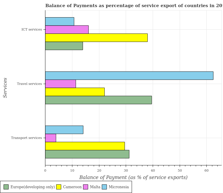
A question based on this chart appears as follows,
{
  "question_id": 1449488,
  "question_string": "In how many countries, is the balance of payment of transport services greater than the average balance of payment of transport services taken over all countries ?",
  "answer": 2
}
The question string matches the following template,
pattern = (r"In how many (?P<plural_xlabel1>.*), "
            "is the (?P<ylabel1>.*) (?P<preposition1>of|in) "
            "(?P<legendlabel1>.*) greater than the average "
            "(?P<ylabel2>.*) (?P<preposition2>of|in) (?P<legendlabel2>.*)"
            " taken over all (?P<plural_xlabel2>.*)\s?\?$")
and yields the following matched groups,
{
  "plural_xlabel1": "countries",
  "ylabel1": "balance of payment",
  "preposition1": "of",
  "legendlabel1": "transport services",
  "ylabel2": "balance of payment",
  "preposition2": "of",
  "legendlabel2": "transport services",
  "plural_xlabel2": "countries "
}
This ultimately helps us produce the following caption:
The balance of payment of transport services is greater than the average balance of payment of transport services in 2 countries.
Following this process for all the Q&A pairs present in the “Reasoning” category of PlotQA, we end up with nearly 18 million captions over 15070 charts. After the captions are generated, I put them through a grammar check repeatedly until a majority of common errors are resolved (by my estimates, no more than a few hundred captions should have grammatical errors).
The entire process of caption generation, grammar checks, and grammar fixes is implemented and documented in this GitHub repository:
The chart images and their annotations are carried over from the original dataset, with captions added separately for each image and Q&A pair.
Download the dataset here and explore it. Any feedback, thoughts and comments are welcome (create an issue on the Github repository).
Have fun!